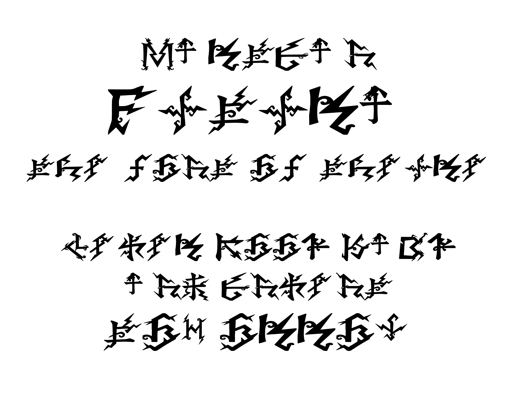
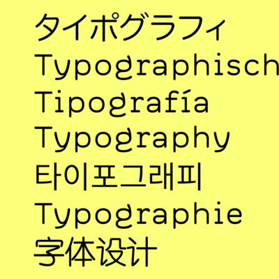
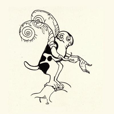
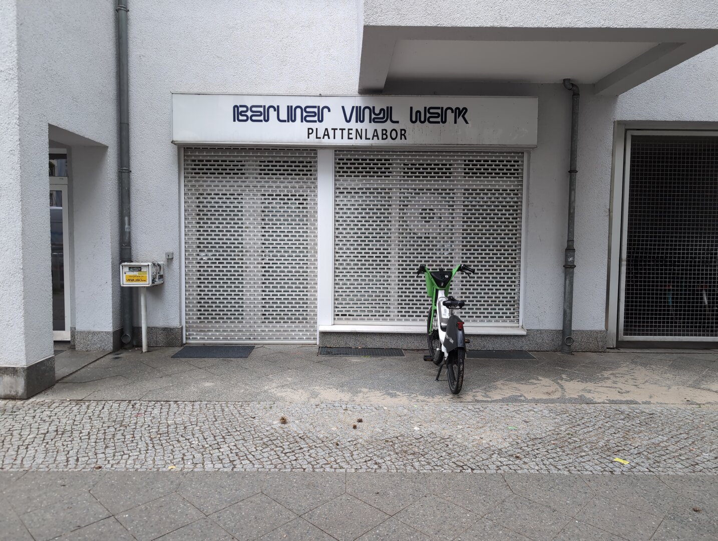
The new MARTIAN FUTURA font based on Hélène Smith's 1890s energy glyph language is opening a surprisingly preternatural framework for glyphic sentience. The is still raw, haven't processed the kerning and character specific details. But yummy yummy.
typography
Font Fight!; U-Bahn Font; The Ultimate Oldschool PC Font Pack
Free fonts galore in today’s typography-centric edition of the Drop.
TL;DR
(This is an AI-generated summary of today’s Drop using Ollama + llama 3.2 and a custom prompt.)
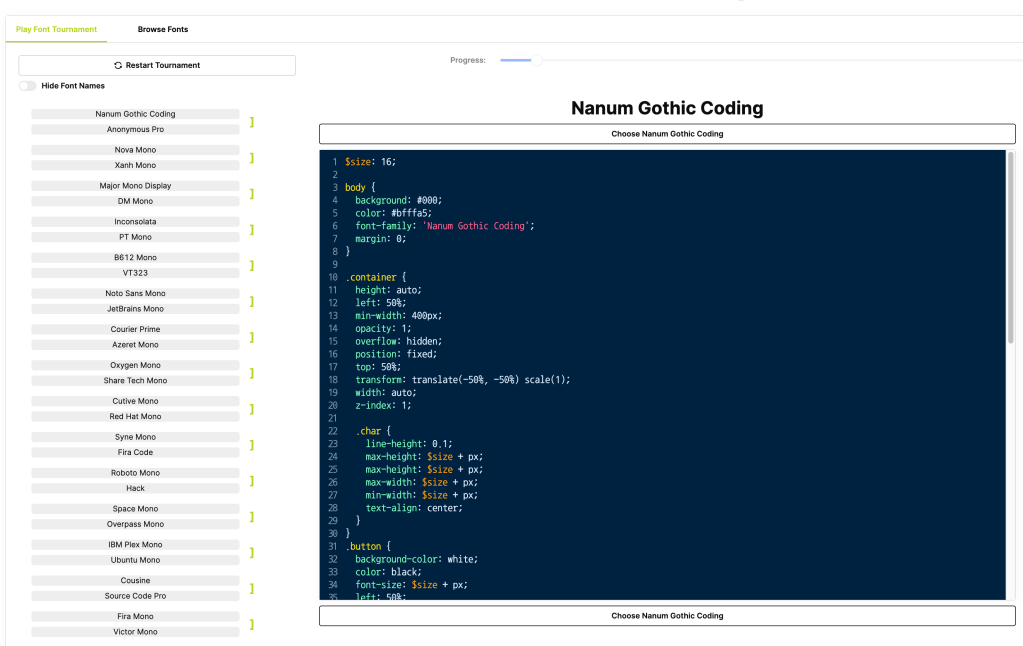
Font Fight! offers an interactive platform to find the ideal coding font through side-by-side comparisons (https://www.codingfont.com/)
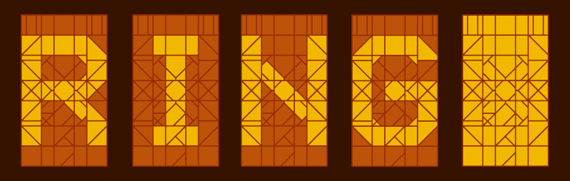
The U-Bahn font project aims to create an open-source font based on Vienna’s U3 line digital displays (https://github.com/gheja/wu3-segments/)
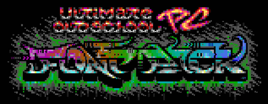
The Ultimate Oldschool PC Font Pack provides pixel-perfect remakes of vintage PC text mode fonts in modern formats (https://int10h.org/oldschool-pc-fonts/)
Font Fight!
Coding Font is a fun, interactive platform designed to help us find our ideal coding font.
It offers a gamified experience to help us discover the perfect coding/terminal font (if such a beast truly exists).
To play, you compare different fonts side-by-side to ultimately help decide the “winner”.
While you’re there, also check out their coding font blog!
U-Bahn Font
I’ve never been on the U-Bahn, but a recent project (link below) caught my attention, and caused me to poke at it a bit due to the typography choices the made by the transport agency.
It turns out that the typography used on the Vienna U-Bahn, particularly on the U3 line, is a deliberate, thoughtful component of the system’s visual identity and wayfinding design. A custom sans-serif typeface is employed throughout the network, characterized by clean, geometric letterforms with consistent stroke widths and open counters (fancy term for the enclosed spaces in letters like ‘a’, ‘e’, and ‘o’). These features enhance legibility across various sizes and distances, helping passengers quickly process information in a fast-paced metro environment.
The U3 line designation features a distinctive typographic treatment. The letter “U” is typically set in a bold, sans-serif font, with the number “3” placed next to or slightly below it. This “U3” combination is often enclosed in a colored square or circle, using the line’s official orange color. This was also a deliberate design choice to help passengers rapidly identify the line and distinguishes it from other signage information.
Station names on the U3 line, as well as other lines in the system, are usually set in all capital letters using a bold weight of the system font. They are displayed in large, easily readable sizes on platform signage and inside trains, further aiding passenger navigation.
Color coding complements the typography to reinforce line identification. The consistent use of the U3’s orange color appears in the background of line designations, wayfinding elements like directional arrows, and on line maps and informational graphics. This consistent color usage enhances visual coherence and aids in distinguishing the U3 line from others.
In addition to static signage, many U3 stations feature digital displays that utilize a similar sans-serif font to maintain consistency. These displays often employ high-contrast color schemes—such as white or yellow text on dark backgrounds—to improve readability.
The digital displays captivated Gabor Heja, who started a project to create an open source font based on these designs. The LCD segments in the font are based on my Gabor’s own works (i.e., photos taken on subway stations), and he gives credit to various folks who’ve helped capture images of different letters.
The font is not yet complete, but it’s super fun to watch this effort come together.
The Ultimate Oldschool PC Font Pack
This section goes out to fellow nerds of a certain, simpler era.
If you’re speed-reading past this section, please at least take a moment to select the “artwork” at the bottom of the page of the link, below, to revel in how it was crafted. Tis a thing of beauty.
The Ultimate Oldschool PC Font Pack is a meticulously crafted collection of pixel-perfect remakes of text mode fonts from vintage PCs and compatible systems, converted into modern TrueType and bitmap formats. Concentrating on hardware and firmware character sets originally embedded in ROM chips on system boards and graphics cards, the collection hopes to preserve the authentic typography of early PC text modes.
The fonts are available in several variants to cater to different needs:
‘Px’: TrueType fonts with pixel-perfect outlines, maintaining the exact design of the original pixels.
‘Mx’: TrueType fonts with embedded bitmaps, combining scalable outlines with bitmap data for precise rendering at specific sizes.
‘Ac’: Aspect-corrected TrueType fonts adjusted to replicate the original non-square pixel ratios of old display hardware.
‘Bm’: Bitmap-only formats suitable for environments where vector data is unnecessary or unsupported.
There are two character set options:
‘437’: Contains the original 256 characters from IBM PC Code Page 437, offering the classic DOS character set.
‘Plus’: Features extended character sets with approximately 780 glyphs, accommodating a broader range of characters and symbols.
The glyphs are designed to look best at their original pixel sizes or integer multiples. The aspect-corrected versions are particularly significant for reproducing the unique non-square pixel ratios characteristic of early display technology.
The collection includes detailed usage notes for Windows, web applications, and working with DOS/CP437 text files. The collection is regularly updated and boasts over 200 font families as of version 2.2.
FIN
Remember, you can follow and interact with the full text of The Daily Drop’s free posts on Mastodon via @dailydrop.hrbrmstr.dev ☮️
https://dailydrop.hrbrmstr.dev/2024/10/01/drop-538-2024-10-01-typography-tuesday/
Why do so many apps, and especially #AppleNotes (that does so much else good), not get paragraph spacing right?? 😤
––––––––––
My Biggest Small Gripe With Apple Notes
(And (Obviously) Objectively Correct Principles for Paragraph Spacing)
https://havn.blog/2024/09/20/my-biggest-small.html
#Allheimen #Apple #Typography
New on the Blog:
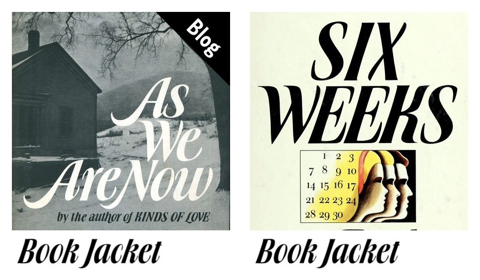
A homage to Ursula Suess on the occasion of her 100th birthday:
https://fontsinuse.com/uses/62531/as-we-are-now-book-jacket
The German-American artist designed many book jackets for publishers in NYC. In 1971/72, she created a typeface derived from her lettering, named Book Jacket.
@fhardwig shows examples of Book Jacket in use, including two by the designer herself.
🔴 📰 🎥 Paleography and the Book Lecture “Where Did Newspaper Typeface Come From?”
“UChicago visiting scholar David Ganz discussed how influential scripts such as Caroline minuscule and Italian Humanistic served as models for typefaces like Times New Roman.”
#Video length: one hour and twenty one minutes.
🔗 https://youtu.be/hnTKDv0vdz0
#Lecture #Paleography #Book #Books #Bookstodon #Script #History #Histodon #Histodons #Typeface #Fonts #Typography #Newspaper #TimesNewRoman @bookstodon @histodon @histodons
I really like the proposed asterism symbol, ⁂, U+2042 to represent the Fediverse. “In astronomy, it refers to groups of stars in the sky, akin to constellations.”
https://symbol.fediverse.info
I might just add it to my fonts, (and perhaps boot the bitcoin, ₿, U+20BF, while I'm at it) Now to see whether I like hexacles (the bestagons) or pentacles..
#charactersetpolitics #fediverse #fonts #typography
🚨 In TWO weeks 🚨
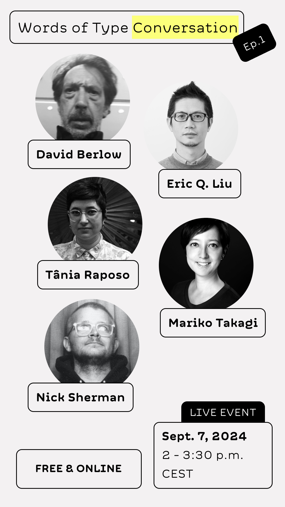
Words of Type Conversation Ep.1.
David Berlow, Eric Q. Liu, Tânia Raposo, Nick Sherman, and Mariko Takagi, will discuss together about the importance of an accurate vocabulary in type design!
#live #event #conversation #discussion #interview #typedesign #typography
📕 The Legibility of Serif and Sans Serif Typefaces (A free, 132-page book from 2022)
Tags: #GraphicDesign #Typography
https://buddhistuniversity.net/content/monographs/legibility-of-serif-and-sans-serif_richardson-john-t-e
#Adobe Research on type composition for 'packed rectilinear layouts'.
📄 Paper: https://openreview.net/references/pdf?id=J875D1eaaS
📼 Video: https://youtu.be/Tv0xQmBYFhw
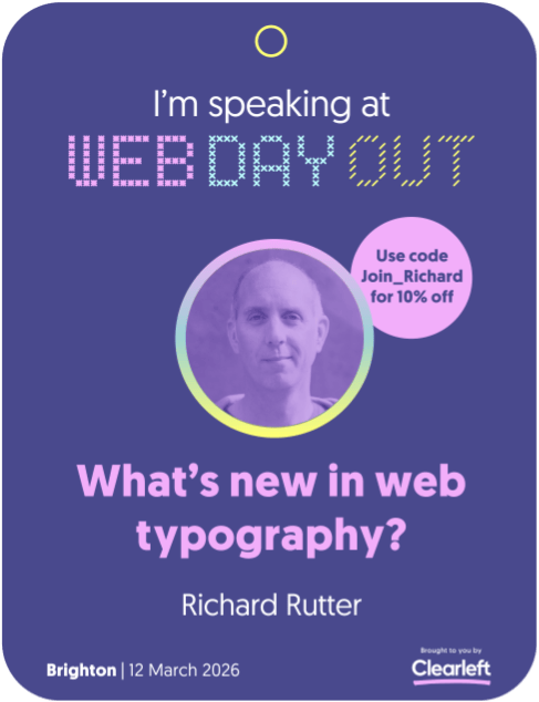
What’s new in web typography?
This is a question I’ll be answering at this year’s https://webdayout.com
I’ll run along the cowpaths that have been paved and spend time with the new and shiny things that bring expressiveness, fine detail, responsiveness, consistency and efficiency to your work: variable fonts in all their glory, typographic units, drop-caps, hanging punctuation, `text-box-trim`, container-aware fonts and fluid type.
Use JOIN_RICH to get 10% off.
if you are under 30 years old and picking a font size for something other people need to read, not just yourself: that’s too small. still too small. A LITTLE BIGGER
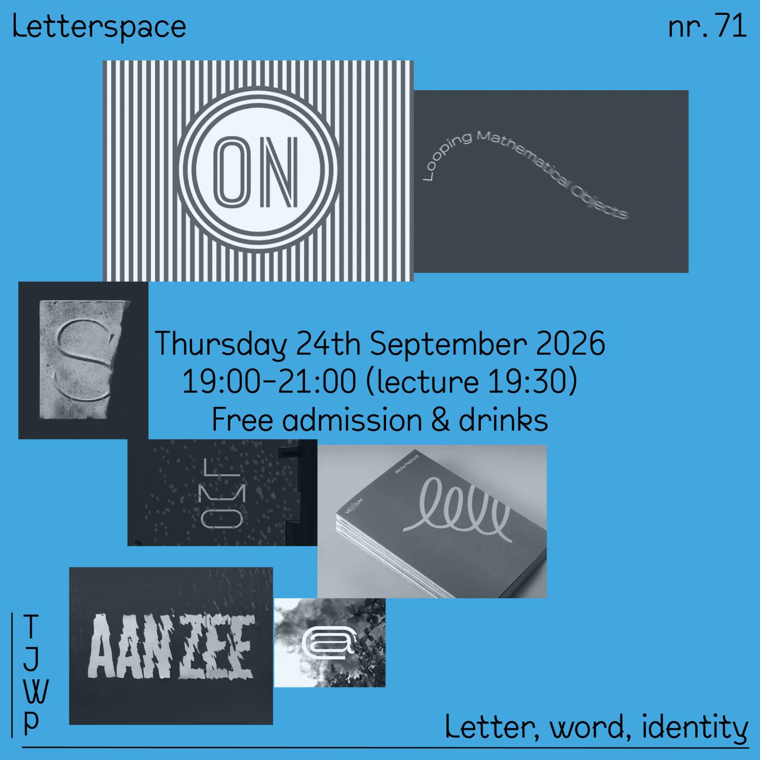
nr.71
TJWP
Letter, word, identity
—
Thursday 24 September 2026
19:00 – 21:00 (start 19:30)
at de Lange Adem
—
The typographic work of TJWP is a central feature for his approach to design. His vibrant, animated treatments of type offer a refreshing burst of color to the often monochrome world of typography and elevate it in layout. With a background in advertising, his letterforms have brought character to major brands, whether as a bespoke typeface or a striking logo. Sometimes he takes the helm as art director, other times he rolls up his sleeves for the meticulous work of font production. https://tjwp.xyz
—
Thanks to @typotheque & PICTORIGHT
—
RSVP: https://letterspace71.eventbrite.com
#Lecture #Typography #TypeDesign #Branding
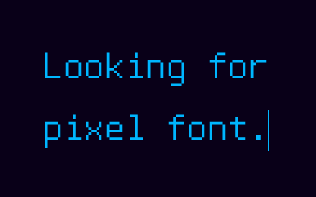
I'm a bit of a typography nerd but I need the help of better nerds, please and thank you:
- I'm looking for a *multilingual* (eng, spa, catalan) pixel font with *italics* and **bold**. (No easy task)
- It's for my personal daily use, I'll be writing and reading lots of text with it, so it needs to be *readable* above all else
- I love the look of Px IBM PS2thin4, see attachment
Any ideas will be welcome!
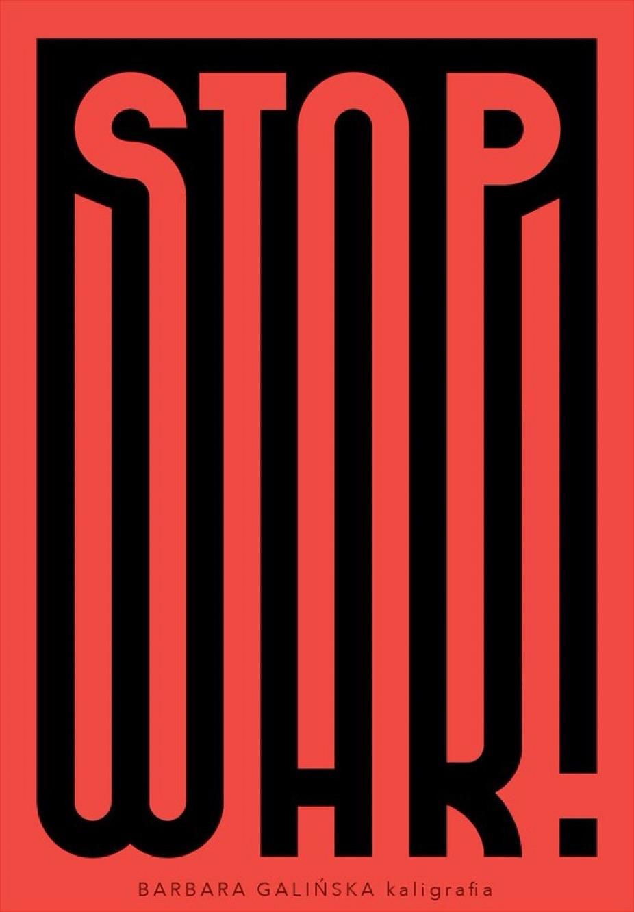
Spread this #Typography masterpiece
by Barbara Galińska
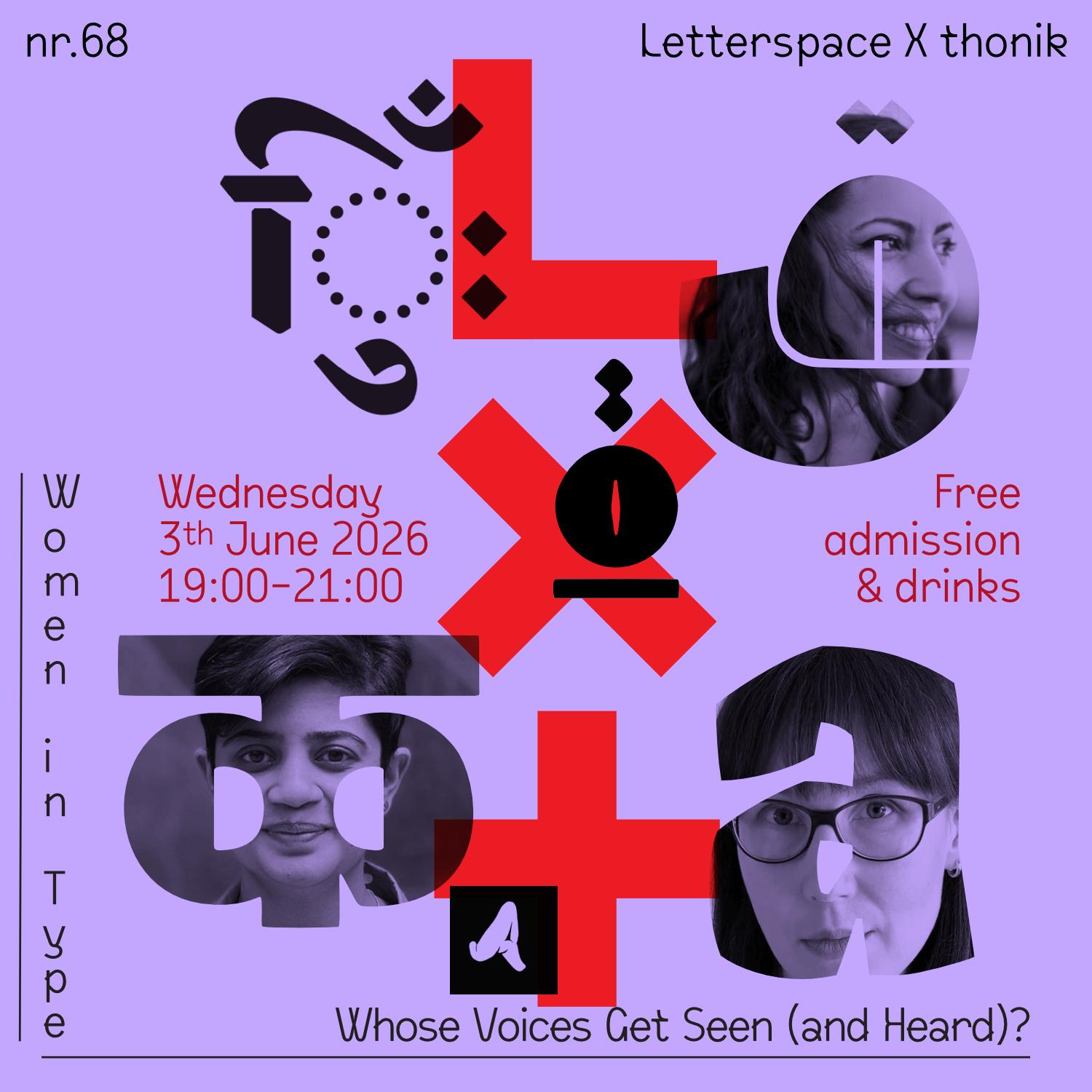
nr.68
—
Women in Type
Whose Voices Get Seen (and Heard)?
—
Wednesday 3. June 2026
19:00 – 21:00 (start 19:30)
at thonik line up, #Amsterdam
—
Whose voices are seen and heard in type design? Who is remembered, and who is elevated as a reference? Representation is of paramount importance: it defines who has a place in the industry and who has the power to shape it.
This WiT Talks panel examines the politics of representation and its importance for women designers around the world. Organised by Women in Type, a platform led by Flavia Zimbardi @flaviazim, this roundtable brings together @AleksandraSamulenkova, Lara Captan and Pooja Saxena @matratype.
—
Thanks to @typotheque & PICTORIGHT
—
RSVP: https://letterspace68.eventbrite.com
#Lecture #Typography #Feminism #WomenInType
#introduction
hejka, jestem Zosia 🤠 potrzebuję miejsca, żeby pisać sb rzeczy i czytać sb rzeczy. co czytać? co pisać?
załączam hasztagi:
#art #illustration #graphicdesign #typography #animation #mograph #ecology #nature #sociology #socialjustice #literature #books #reading #queer #psychology #neurodivergence #fashion #thrifting #fandom #histories #diy #food #cooking #baking #maps #geoguessr
#sztuka #ilustracja #projektowanie #liternictwo #animacja #ekologia #przyroda #socjologia #sprawiedliwoscspoleczna #literatura #ksiazki #czytanie #psychologia #neuroroznorodnosc #moda #lumpiarstwo #starocie #historia #zrobtosam #jedzenie #gotowanie #pieczenie #mapy
Humble is a book of images without pictures. i am not humble, but i am trying... my first and probably only book, a snapshot of some of the ideas that challenge my worldview. this is a small print run i made for #book afficionados. free online version also available.
#books #philosophy #graphicdesign #typography
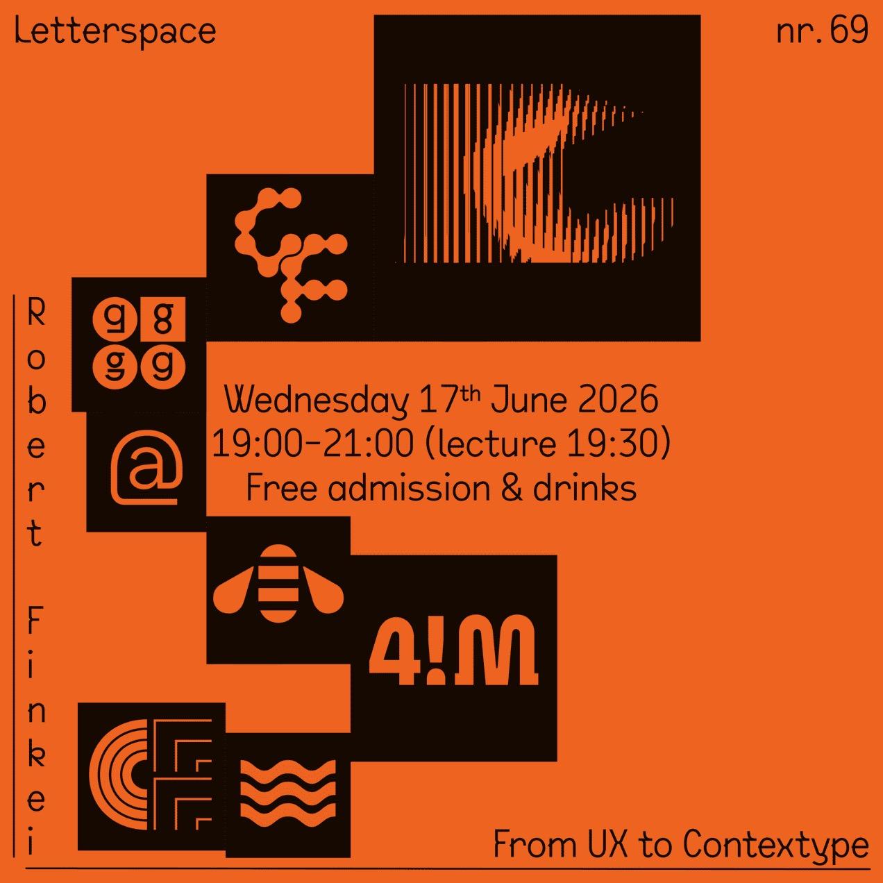
nr.69
—
Robert Finkei
From UX to Contextype
—
Wednesday 17 June 2026
19:00 — 21:00 (start 19:30)
at de Lange Adem
—
With Robert Finkei, we venture into a corner of type design we haven't explored much before. His background as a UX designer brings a surprising and refreshing perspective to the discipline. Through his project User Type Lab, he A/B tests individual letterforms with users and feeds results back into his typefaces, without ceding art direction to the data. Together with his Slovak school friend and business partner Michal Chrastina, he runs https://Contextype.com, a foundry that is set to release a new typeface very soon.
—
Thanks to @typotheque & PICTORIGHT
—
RSVP: https://letterspace69.eventbrite.com
#Lecture #Typography #UX #Amsterdam #Rietveld
A move to the center: some brief thoughts on the typography of the Harris/Walz 2024 US Presidential Campaign.
https://fontsinuse.com/uses/63052/harris-walz-2024-us-presidential-campaign
#Fonts #Typography #KamalaHarris #HarrisWalz #Politics #FontsInUse
Visto che dalle mie parti si trovano solo lavori di merda, ho deciso di dar vita a un qualcosa di appagante per me e utile per i miei colleghi. Ho deciso di dar vita a Daily Graphics: un canale Telegram interamente dedicato al mondo della grafica. Non mancheranno consigli, notizie, sondaggi, approfondimenti e l'open source. Per favore, condividete in tutto l'etere questo mio nuovo progetto. #graphicdesign #logodesign #grafica #branding #typography

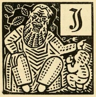
Illustration by Ernst Schneidler, from Deutsche Märchen seit Grimm (1919).
Source: University of Connecticut Libraries / Internet Archive
https://pdimagearchive.org/images/a9215283-c8af-4df1-8ce6-67489073f37a